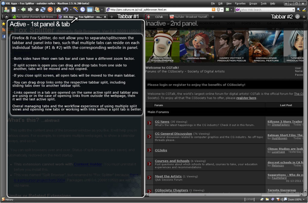
The current implementation of using split tabs in vivaldi is how should say.. awful? terrible? ..ok not great
I’d like to point out the best tab split implementation I have ever seen in a web browser goes to Maxthon2 released like 10years ago… it would be great if Vivaldi tried to better it or at least match it.
I have an old screenshot point out some of the behavior of how it worked…
 ..that web browser skin was my design aswel, miss the days of tabs below address bar and above webpage view made way more sense.. unlike this chromium crap design of tabs above addressbar and and even further above webpage view.. so stupid in design
Anyway the feature is essentially the actual tab bar is split aswel, and whichever active panel you are focused on or were last focused on, is the active panel that new tabs are created on..instead of currently they go back out of the split.. making it kinda crap. The UI/UX is also pretty good in that you can drag/drop tabs and slide them over to a different split panel. When the last tab in a panel is removed the split screen is removed and the tabbar becomes one..
There is a lot of functionality built in around it that simply makes it super quick for the user to invoke a tab split, either carry on using it with which active panel they want… or remove it. The best thing about it really is that each split has its own tab bar.. making it super easy to manage and work with.. instead of what seems to the average implementation of this feature from firefox addons to other browser attempting it.. all seem to fail at adding a good user experience to it. Having only a 1 tabbar, and however many splits without knowing which tabs are on which split, is really incredibly crap.. personally I’d rather just have 2splits and 2tab bars to work with, than numerous splits and a single tabbar making the whole experience and workflow of using current implementations just meh not worth bothering with most the time
Please make this next years wishlist 